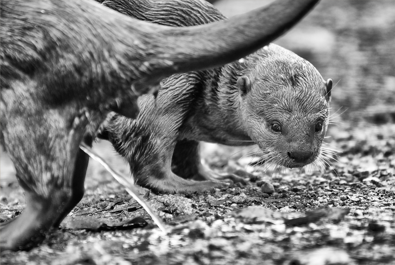
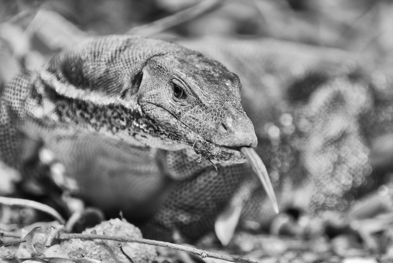
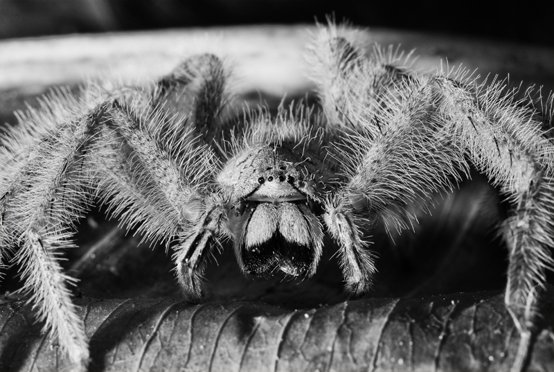
aka ‘Everything looks better in B&W’, born of a running gag between me and a photographer friend when we went to see the Genesis world premiere at the Natural History Museum.
I had a free guest pass sitting in my wallet from years ago. Ten years ago maybe. It had gone flimsy and was frayed at the edges, looking like the piece of antique that it was. The staff at the exhibition counter refused it, explaining that he couldn’t take it for that would be like ‘accepting a fake ticket’. He advised me to try exchanging it for an exhibition ticket at the Information Counter, which I did, after having my claim that I used to be a member and a volunteer scrutinised by a grumpy man. On hindsight, I should have kept that guest pass, but I guess sentimentality can be saved for other things. Genesis was quite worth it.
The exhibition is an epic, and I do mean epic, showcase of legandary photojournalist Sebastião Salgado’s best works exploring the human-nature relationship, the accumulation of eight years of expeditions through 32 countries. The show presents over 200 photos selected from the much larger Genesis project, displayed on maze-like wall-after-wall-after-turn-after-wall walls. To fully attend to the exhibition demands quite a load of sustained patience and lots of time, as if Salgado wanted to share the momentous scale of his epic marathon journey with his audience.
From the Guardian’s review of the exhibition:
Salgado’s habitual monochrome runs all the way from coal black to silver and burning white, with a thousand tones of grey in between. The lighting is characteristically spectacular, with plenty of backlighting and operatic contrasts. And the further one goes through the show, the more significant the decision to photograph the world in black and white becomes. Nothing can have absolute or accidental priority in monochrome, nothing can leap out simply by virtue of its colour. Black and white puts everything on equal footing, on the same planet.
His photos, taken in digital format in a departure from his previous usual practice, are variously curated, with many showing a blatant disregard for the conventional rules of good photography. There are high contrasts in some, high tonality, HDR-like effects in others, slanted horizons, grainy look intentionally reminiscent of the Kodak Tri-X film, washed out highlights, lost details in shadows… But, somehow, Salgado manages to pull it all off and it just ‘works’.
While he is clearly a master at work when it comes to landscapes and human or environmental portraits, some of his wildlife shots are a little underwhelming. However, all his images are dramatically beautiful (his chosen subjects are, in their own right, and so is the aesthetic quality of his photography) and evocative of an old-fashioned romantic, sublime nature – a world that we are losing if not already lost.
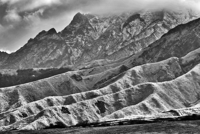
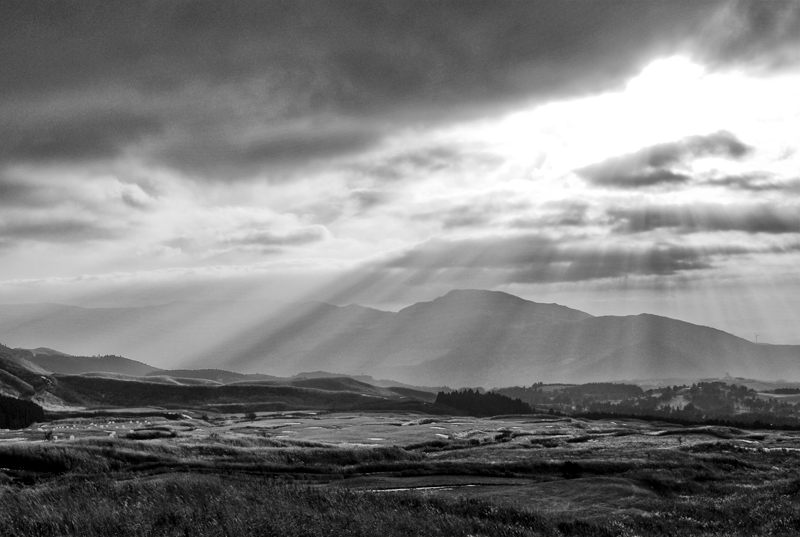
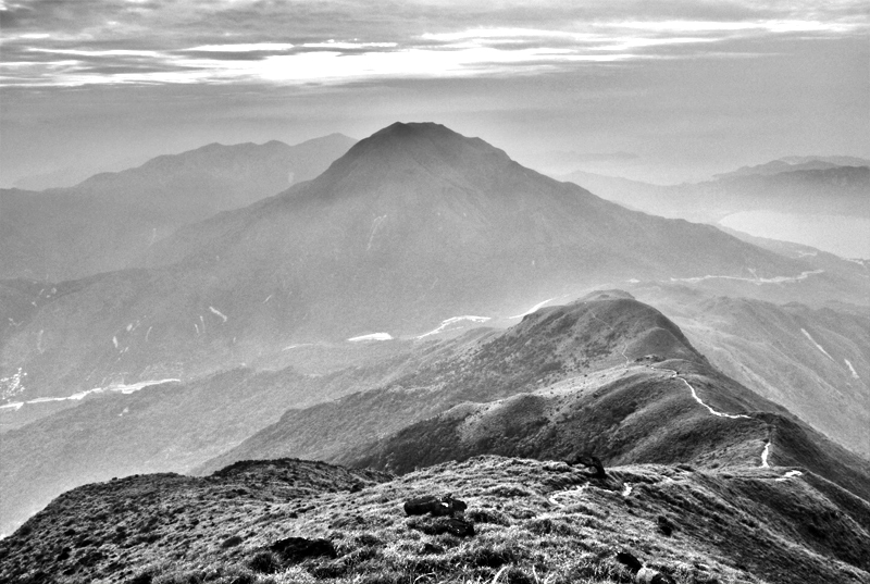
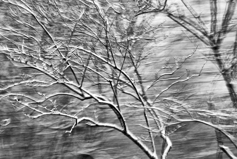
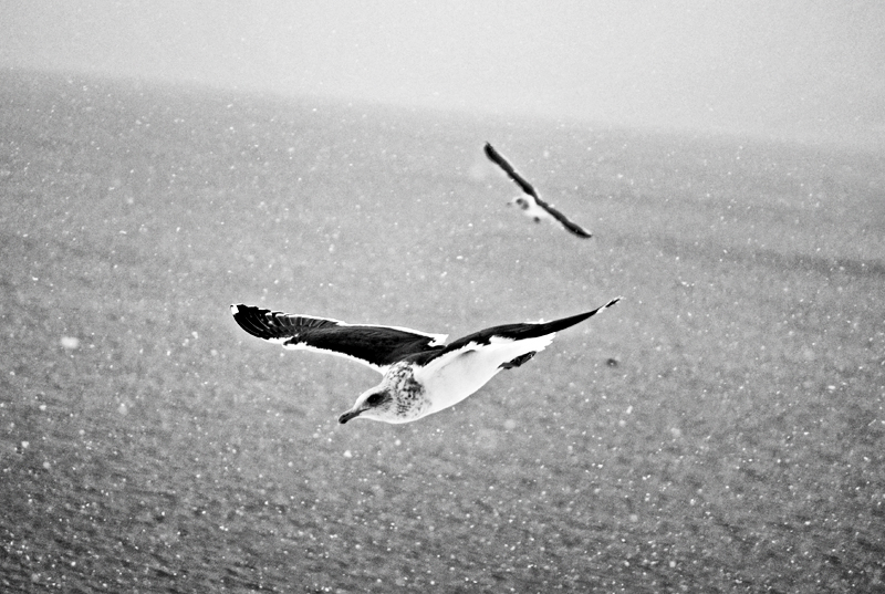
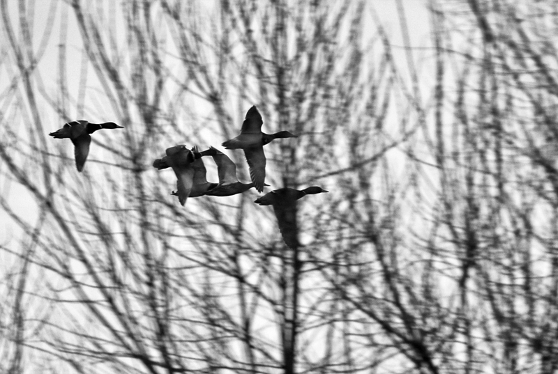
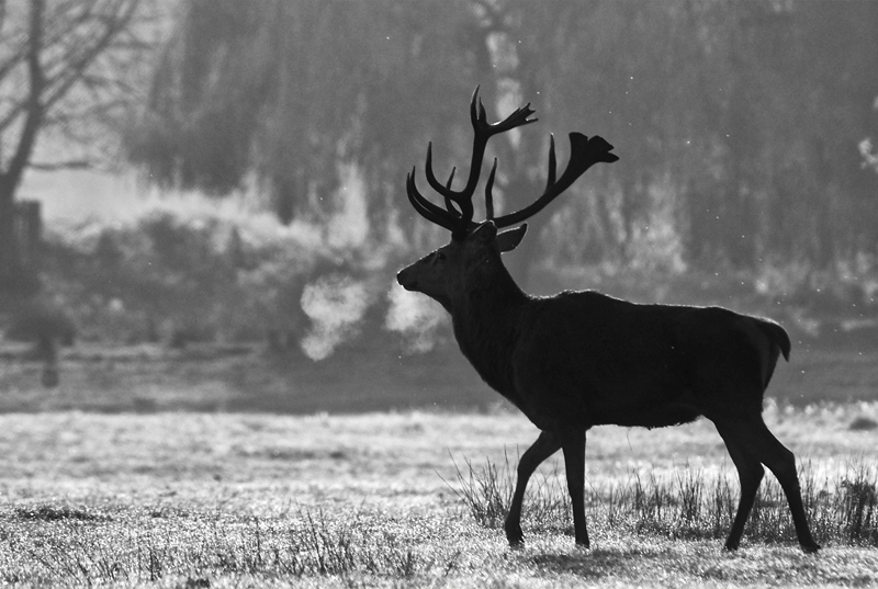
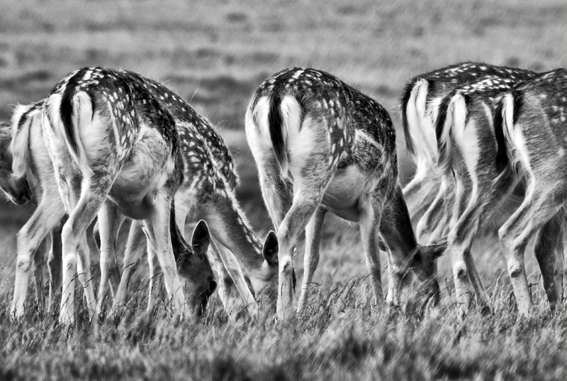
This is my own little experimental take, on a much more humble, tame, and mediocre scale.

